What do the similarities and differences between places tell us about how COVID-19 is spreading?
Post I made for the Topos COVID-19 app – original post on medium here
Dense urban counties with large populations have the most concentrated numbers of cases and deaths caused by COVID-19. This can be attributed to many factors beyond their respective population density, particularly the fact that New York City and Boston (cities containing counties with some of the highest concentration of cases) are global travel hubs. While population density, to a large degree explains the high level of mortality⁽¹⁾ these cities have experienced, there are other factors that also have a statistically significant relationship to mortality and infection⁽²⁾: the number of daily commuters using public transportation networks, the percentage of residential buildings with 50+ units, even the density of pizza restaurants (a subject near and dear to our hearts) in a neighborhood. In this article, we will explore the similarities between counties based on a variety of factors and see whether this can give us insight into death rates across the U.S caused by COVID-19.⁽³⁾ Left: Number of commuters who take public transportation in relation to the total number of deaths. Size of the circles indicates the number of days since stay at home policy was enacted. Both and X and Y axis follow a logarithmic scale. Right: Percentage of large multifamily residential buildings versus total number of deaths as of April 13th
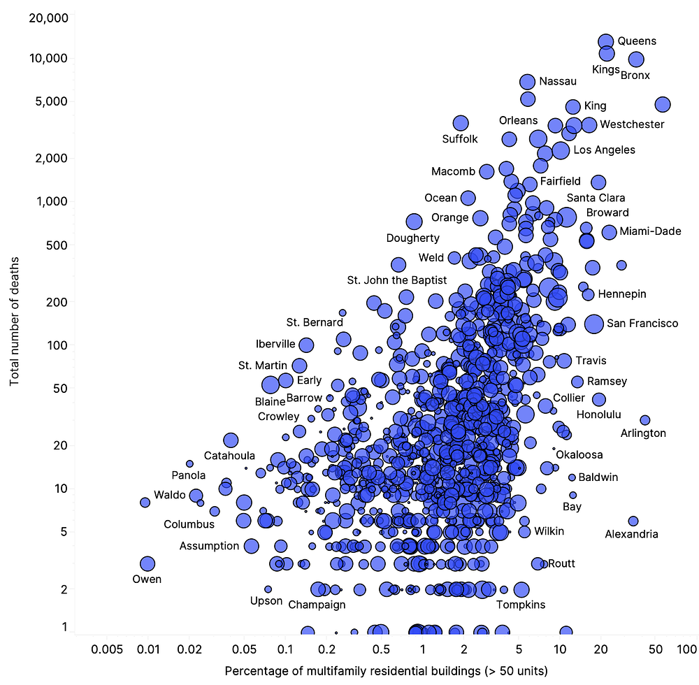
Percentage of large multifamily residential buildings versus total number of deaths as of April 13th
Correlation to total death count
As a location intelligence company, Topos works with thousands of features that describe the way we live together and move around as humans — the types of buildings we inhabit, the modes of transport we use to get to work, the variety of establishments that make up our cities and neighborhoods. We transform these features into billions of data points that give us a holistic understanding of place.
One of the first questions we asked as the pandemic started to unfold was, “What can our features tell us about how the virus is spreading through communities?” Looking at the relationship between the total number of deaths per county and our features, two of the most significant relationships we found were⁽⁴⁾ the percentage of the population who take public transportation (explaining ~70% of the variation in total deaths across the country) and the percentage of 50+ unit residential buildings (explaining ~45%). These relationships remain significant, although with a slightly lower R2 value, when removing counties in New York state.
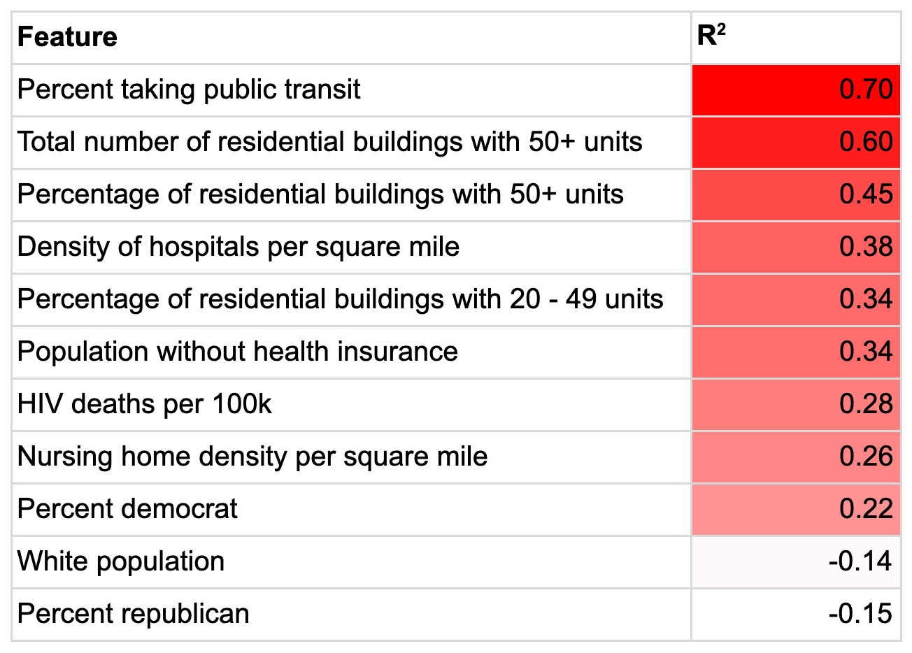
Selection of features correlated to total death counts per county across the country
Similarities and dissimilarities between counties
As a company, one of the core questions we have sought to answer from the beginning is: how do we understand similarity and ‘distance’ between geographies in the 21st century?
Given that the density of residential buildings with 50+ units and use of public transportation show such a strong relationship to the number of deaths caused by COVID-19 we can study the similarities and differences between counties based on mode of transit and residential housing type⁽⁵⁾ to see if they can give any insight into how the virus may impact a community. We construct our transit + housing based similarity metric using ‘cosine distance’ to measure the similarity across geographies. Cosine distance is a calculation frequently used to study the distance between entities in high dimensional vector spaces; here it enables us to compare counties across several relevant dimensions at once.
Based on this transit + housing based similarity metric, the two most similar counties to Brooklyn (we chose Brooklyn as it has one of the highest mortality rates in the country as of April 13th, 2020) in terms of commuter mode of transportation and housing type are Manhattan and The Bronx, not surprising, given that New York City has the most extensive public transportation network and highest concentration of high rise buildings in the country. Following closely behind are counties in DC, San Francisco, and Chicago.
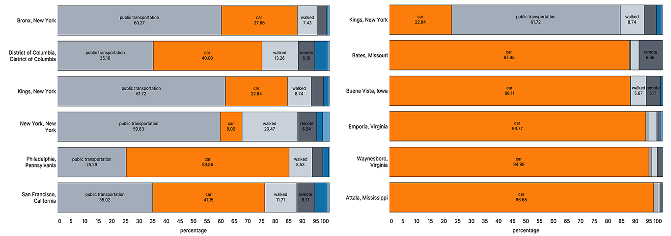 Left: Breakdown of percentages of transportation type for most similar counties. Right: Breakdown of percentages of transportation type for dissimilar counties
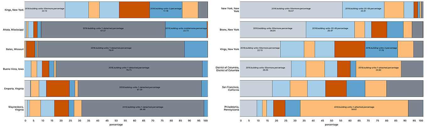 Left: Percentage breakdown of housing type for dissimilar counties Right: Percentage breakdown of housing type for most similar counties.

Top: 20 most similar counties to Brooklyn (Kings) in terms of our similarity metric encompassing residential building type and commuter mode of transportation.
![image not found][deaths_since] [deaths_since]: https://miro.medium.com/max/1000/1*hIvG2qI8rsBxf5ArEc-wgg.png Moving average of deaths since deaths reached > 10 of most similar counties to Brooklyn in terms of transportation and housing type
Similar trajectories of daily deaths can be seen in many of the most similar (as measured by the transport + housing-based similarity metric) counties to Brooklyn. This is not surprising as both the density of public transportation and percentage of 50+ unit residential buildings correlate highly with the numbers of deaths we’ve seen so far. San Francisco however seems to be bucking the trend. This could be due to a myriad of factors, below we highlight three: SF has a lower proportion of public transit commuters, a slightly lower density of large residential buildings (both metrics feeding our similarity calculation) and the county implemented the stay at home policy five days earlier than Brooklyn did.
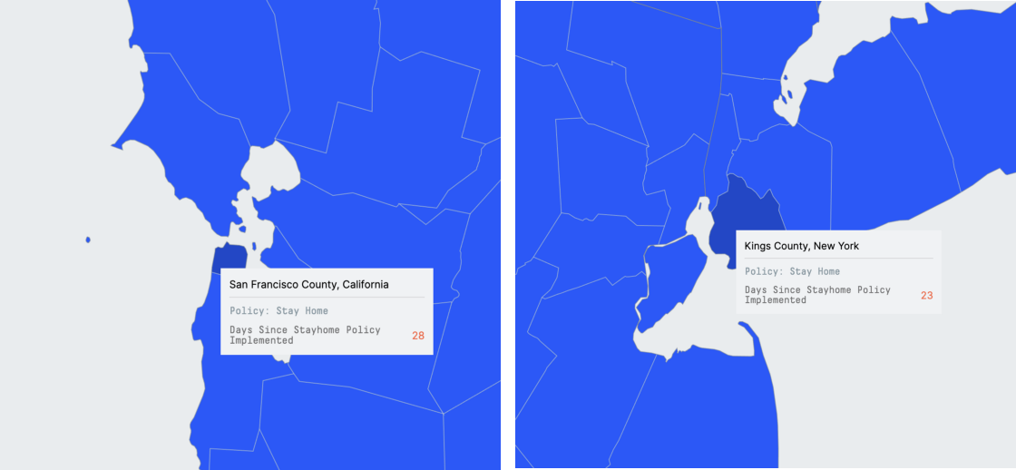 Stay Home Policy status in San Francisco and Kings County
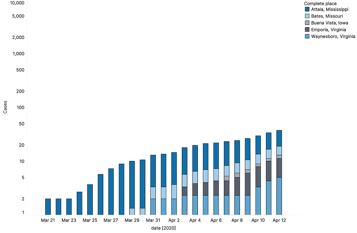 Number of cases over time for most dissimilar counties to Brooklyn
If we look at the number of cases over time for the most dissimilar counties to Brooklyn, in terms of the distributions of commuter transportation and housing type, we can see that the growth of cases is a lot slower than that of the counties in NYC. Whereas initially Brooklyn saw cases double every 5 days, in Waynesboro, Virginia or Attala, Mississippi cases are doubling every 14–16 days. None of these counties have seen any deaths so far (as of April 13th, 2020).
Similarities between cities
When we zoom out to look at the data at the city-level (here we use Combined Statistical Area to define a city), the features that correlate most highly with death rates differ slightly from those at the county level. There is a strong relationship between older populations and higher death rates from COVID-19; and with the removal of New York City from the analysis, the density of single family detached homes becomes a highly correlated feature, explaining ~65% of the variation.
 Selection of features correlated to total death counts per CSA across the country excluding New York City
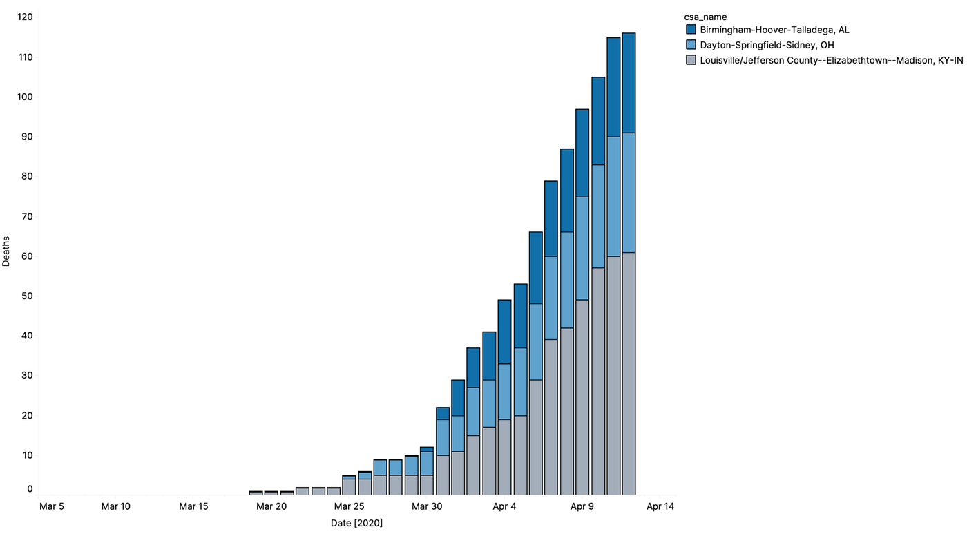
This time, we will look at similar cities to a current (as of April 13th, 2020) well known hotspot — Detroit — and see which cities are most similar based on the highly correlated features listed above: age of the population, density of residential building types, and the distribution of household income.
 Top: 20 closest/most similar cities to Detroit in terms of age of the population, transportation, and building units
The most similar cities are widely dispersed geographically, from Louisville to Greensboro. Picking 3 of the most similar cities, Louisville, Dayton and Birmingham, we can see that although their daily death rates are currently much lower than Detroit’s, the growth rates are starting to ramp up. Given the similar distributions of older vulnerable populations, these cities may see cases rise even further.
Footnotes
- 1: Population density accounts for 45% of the variance in mortality rates across the country, p < 0.0001
- 2: We used Pearson correlation to study the relationship between the number of COVID-19 cases + deaths and other factors.
- 3: We look at death rates as opposed to the number of cases due to the variation in testing policy across the country.
- 4: Pearson correlation calculated April 13th 2020 across the US. Data comes from the 2018 American Community Survey
- 5: Similarity as measured by the mode of transportation + housing type includes: percentage of commuters who drive, take public transit, cycle, work remotely, walk, and use a car service. As well as percentage of single family detached, single family attached, mobile homes, RV vans, and buildings with units ranging from 2, 3–4, 5–9, 10–19, 20–49, and 50+
Data Sources:
- COVID-19 cases by county, The New York Times (source)
- 2018 demographics by county, American Community Survey, 2018 (source)
- US election data, MIT Election Lab (source)
- Local Covid-19 policy, Kaiser Family Foundation (source)