Disease models & differential equations: connecting geographies with time series clustering
Post I made for the Topos COVID-19 app – original post on medium here
Projections from mathematical models of infectious disease are guiding policy decisions around the world in the fight against COVID-19. While most of these models are specific to the institutions that develop them, they share basic mathematical principles: they divide a population into different groups and try to simulate how the population transitions from one group to the next. In particular, the SIRD model — one of the most frequently used — divides the population into four groups: those who are susceptible to the virus (S), have become infected (I), recovered (R) and died (D). In this article we explore a modified version of the SIRD model to study COVID-19 time series data across the US. Specifically, we use polynomial regression to fit an SIRD model to real world data and utilize the estimated parameters of the model to cluster geographies across the US.

Animation of an SIRD model with changing parameters (from Wikipedia)
What are disease models?
Disease models (such as SIRD) stem from research done by a group of British doctors, mathematicians and epidemiologists that was presented in a series of articles published from 1927 to 1933. Their aim was to explain the rapid rise and fall in the number of infected patients observed in epidemics such as the London cholera outbreak of 1865. Contemporary disease models are used to predict properties of an epidemic such as its duration, prevalence, and the virality of its spread. The simplest models make some basic assumptions: everyone has the same chance of becoming infected, the infected are equally infectious, and the level of contact between people in a population is equally distributed. Advanced implementations subdivide populations into more granular groups based on factors like, age, sex, and health status. They may also incorporate exogenous factors such as population density and policy decisions.
The mechanics of an SIRD model
An SIRD model can be described through a series of differential equations.

Where γ is the rate of recovery (the inverse of the duration of sickness), β is the transmission rate, μ is the mortality rate and N is the total population. The first equation governs the rate of change for the susceptible group, which decreases at a rate proportional to β as individuals go from susceptible to infected. Individuals in the infected group move at rates proportional to μ and γ into either the recovered or deceased group. The ratio of β/γ is an estimation of the R0 which is the reproduction number or probability of an individual in a population infecting someone else.
In their basic form these models do not consider geographic, demographic or policy contexts. However, geo-specific features such as commuter patterns and housing density are significant factors in understanding how COVID-19 spreads through communities (as discussed in our previous article examining geographic similarity in relation to COVID-19). Here we modify the basic SIRD model to capture variations in geography: we add a term to capture local adherence to social distancing, and we adjust the number of susceptible individuals to factor in vulnerable populations across the country. The equations are adjusted as follows:

Where the addition of ρ captures the extent to which individuals are choosing to shelter in place, thus flattening both the infections and mortality curves. Here N becomes the proportion of the population who are eligible for testing[1].
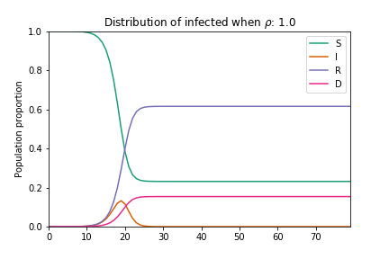
Animation of an SIRD model with changing rho parameter
Curve fitting and parameter extraction
With this modified SIRD model in hand, we set about fitting it to county-level US COVID-19 data. Our goal is to develop a robust understanding of the characteristics of curves across counties (what counties saw gentler progressions, exponential growth, or sudden spikes). We assume all parameters are unknown and attempt to optimize the parameters using nonlinear least squares regression to fit our model to actual COVID-19 data. Under the hood, we’re iteratively optimizing the bounded parameters of the SIRD model β, γ and ρ (minimizing the sum of squared differences) so that the model closely follows the curve/growth patterns seen in actual data[2]. Using estimated parameters from the model gives us a succinct way to describe the impact of social-distancing, the virus’ virality and the contact rate of populations over time, across the country.
With governments regularly revising the number of cases and deaths reported as new data comes in, we cannot be 100% certain that the numbers we see reported on a given day will be the same the following week. To account for this uncertainty, we artificially add noise to our dataset by assuming that errors will be normally distributed and that variation will diminish over time as reported numbers stabilize.

Example of output from polynomial regression showing values of the three parameters and the curve fitted to real world data for the Los Angeles county
Relationship between model parameters and spatial features
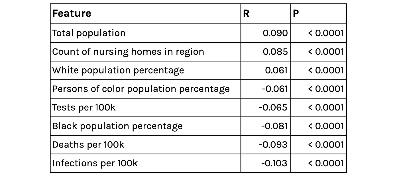
After extracting model parameters using nonlinear least squares regression, we study the relationship between these parameters and our county-level spatial features. The relationships to the parameter capturing adherence to social distancing are statistically significant, albeit fairly weak. It is positively and negatively correlated with higher percentages of white and black populations respectively. This speaks to similar findings that show adherence to social distancing policy is lower in communities of color, as individuals are more likely to work in jobs that are deemed essential or have higher in-person contact. This parameter is also negatively correlated with the rate of testing per 100k people, which suggests that counties with more rigorous testing frameworks are also taking social distancing measures more seriously.
Selected correlates of the extracted Rho parameter (capturing the effectiveness of social distancing)
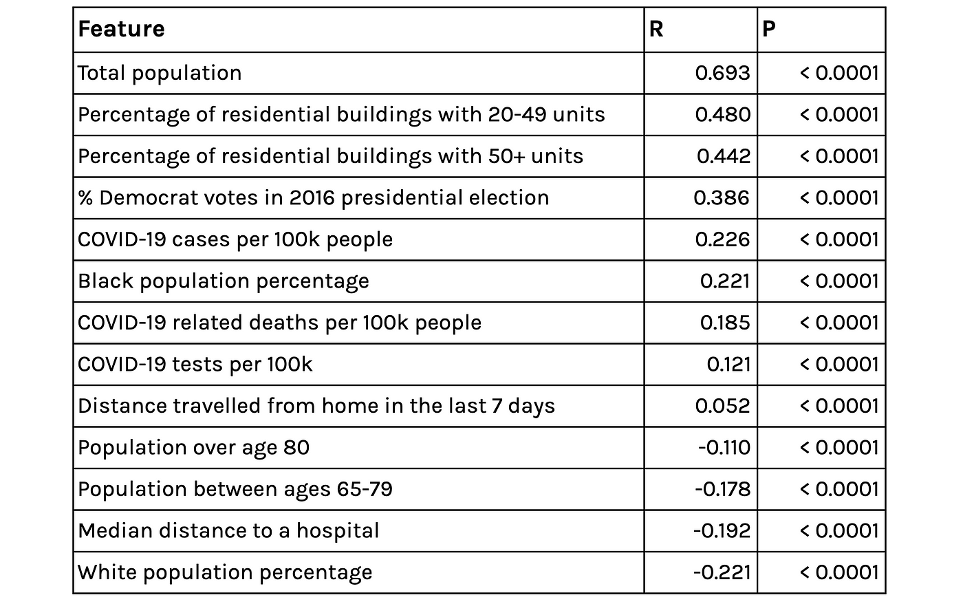
Looking at the derived contact rate (ρ and β) and Topos’ geospatial features surfaces some intuitively sensible relationships: The contact rate is higher in denser, urban areas and in areas where residents have travelled further in the last 7 days, but lower in areas where the median distance to hospitals is larger (sparse/ rural communities). There are also some interesting relationships between the derived contact rate and ethnicity and voting. These findings echo correlations described in our previous article.
Selected correlates of the extracted contact-rate parameter BetaRho*
Clustering geographies based on curves
The output of our regression is a set of curves that closely approximates[3] the observed spread of COVID-19 in the US and the three parameters of the equations that describe the various rates of change in population groups. With these parameters in hand, we can now group counties in the US based on the functions governing their curves. In particular, we use K-means clustering to group counties based on estimated parameters[4].

Total number of cases over time by cluster.
Looking at the above chart, we see that our clustering has successfully distinguished various characteristics of the outbreak across the US. The counties that had early, rapid outbreaks (like those in Westchester, New York City and Yonkers) are grouped together (cluster-4). The counties that had outbreaks a few weeks later (in mid-March) but also saw rapid growth (like those in Ann Arbor and Baton Rouge) are also clustered together, as are other groups that saw later outbreaks with gentler slopes.

Growth in new infections versus population per square mile, sized according to total cases and colored by cluster.
Visualizing the relationship between recent growth, density and total cases by cluster reveals some interesting insights. We can see that counties that are currently (as of April 23, 2020) seeing the largest case percentage increases are those in cluster 0, 1, and 3 — those that saw outbreaks start later. We also observe counties that are bucking the “high density leads to a large outbreak” trend. Namely, those in Virginia such as Harrisonburg and Clayton which have above-average population density but below-average case numbers and growth.

Left: Counties that are seeing above average growth in new cases with below average density (people per square mile). Right: Counties with below average growth in new cases with above average density (as of 23rd April 2020)
Virginia Beach City, VA (cluster-1), has a population of 2500/square mile, well above the national average. But it has seen very low recent growth in new cases (as of 23rd April) and low numbers of total cases. Conversely, Apache County AZ (cluster-3), has a population density of 6.4/square mile and less than half the population of Norfolk City (~71k) but is seeing double digit growth in new cases and is above the 75th percentile in terms of total number of cases (as of 23rd April).

Downtown Virginia Beach City, VA
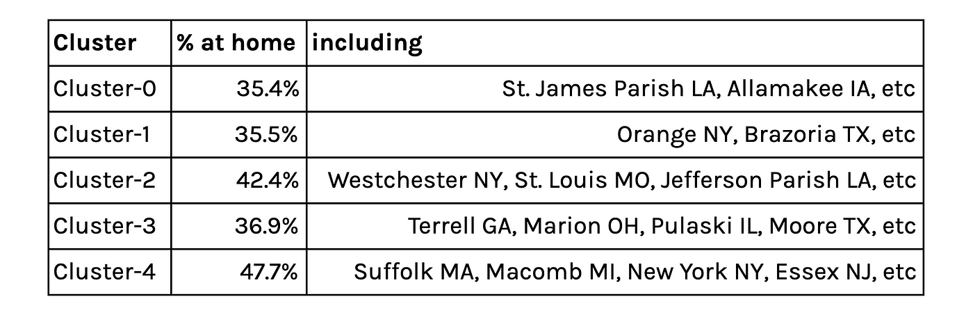
Percentage of the population staying at home over the last 7 days
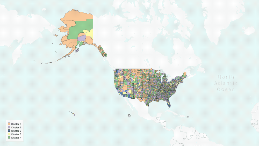
Five Clusters displayed on the map
The average contact rate in counties with early and large outbreaks are significantly higher than all other counties which is to be expected. But recent social distancing measures have been heeded as mobility data from the last 7 days shows that these counties have a larger proportion of people staying at home, as can be seen in the above table.
In this article, we demonstrated how the variations in outbreaks over time reflect adherence to social distancing and the behavioral patterns of people. We also showed that although density plays a critical role in how the outbreak has spread, there are a number of smaller, highly dense communities that appear to be bucking the trend. This article reflects insights we gathered while developing the Topos COVID-19 Compiler — we encourage you to check out our site and share your feedback.
Footnotes
- We acknowledge that eligibility might vary by region and over time; our assumptions about who is eligible for testing are those over 50, health care workers and those with underlying medical conditions
- In our implementation μ was not a bounded parameter and so was not included at this step
- We used the coefficient of determination R2 as measure for goodness of fit for the regression. The mean R2 across all counties analyzed on 23rd April 2020 was 0.92
- We chose five clusters by using a heuristic that graphs the number of clusters versus the average internal sum of squares distances per cluster, where the “optimal” number is found when the internal distances no longer decrease linearly.