Predicting COVID-19 With Tax Returns
Post I made for the Topos COVID-19 app – original post on medium here
Income disparities and COVID-19
The relationship between income inequality and COVID-19 has been widely covered by various sources over the last 60 days. Findings show that the number of deaths and hospitalizations is much higher in low income neighborhoods, and cities with high levels of inequality.[1] Most of these studies rely on income data provided by the US Census, which is self-reported, often extrapolated based on relatively small samples (as in the ACS[2]) and fairly simple in the way income is measured (ie “Median Household Income”). A more nuanced and complete view of income can be gleaned from studying IRS income tax data. Tax data is only available publicly at the zip code level, but provides a highly detailed economic portrait of neighborhoods, particularly in the types of deductions that are claimed (dependents, capital gains, education credits, etc). And rather than being voluntarily self reported (as is the case with the Census/ACS), tax returns are mandated by law, with consequences for false reporting.
Thus while Census data can tell us how many people in a geography have salaries within specific intervals or what the median income of a neighborhood is, tax data can tell us how many people earned $25k — $50k, what proportion of those earnings were deductible (and for what reasons), and how much went to healthcare contributions. In this article, we study the relationship between fine-grained income tax data and COVID-19 cases at the zipcode level in NYC.
To focus our study, we started with tax metrics that generally indicate the top and bottom of the economic spectrum, looking at tax deductions that are only open to earners below a certain threshold (like the Child tax credit ), or income from financial instruments generally utilized by the wealthy (like Capital gains). The table below shows a selection of the correlation coefficients between cases per capita and income metrics in NYC.
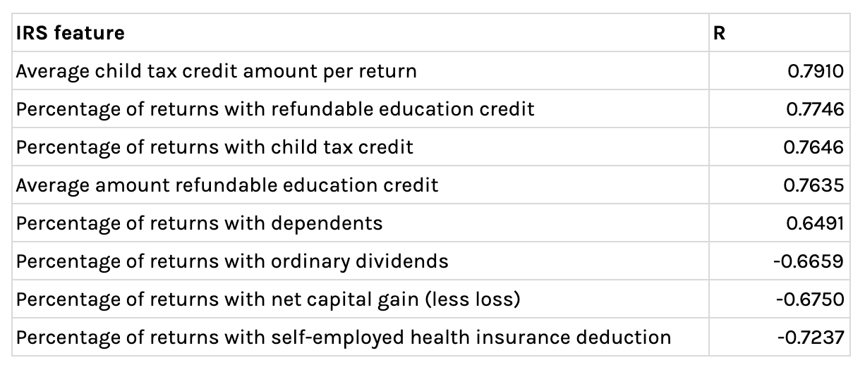
Table showing correlations between cases per capita and various IRS income metrics
The strongest correlation (R = 0.79) to cases per capita is the average Child tax credit amount per tax return. In the year the most recent tax data is available (2017), an individual or family had to earn less than $75k or $110k (respectively) to qualify for it. The amount you receive is determined by how much you earn and how many children are in your household; thus it serves as an indicator for low to middle income families with many mouths to feed. Zip Codes that see the highest rates of child tax credits are lower-middle class neighborhoods like 11239 (Carnasie), 11436 (Jamaica), and 10462 (Pelham). On the other end of the spectrum, zip codes that see the lowest levels of child tax credits per return are: 10005 (Lower Manhattan), 10021 (Upper East Side), and 10003 (Union Square) — neighborhoods with some of the wealthiest residents in the city.
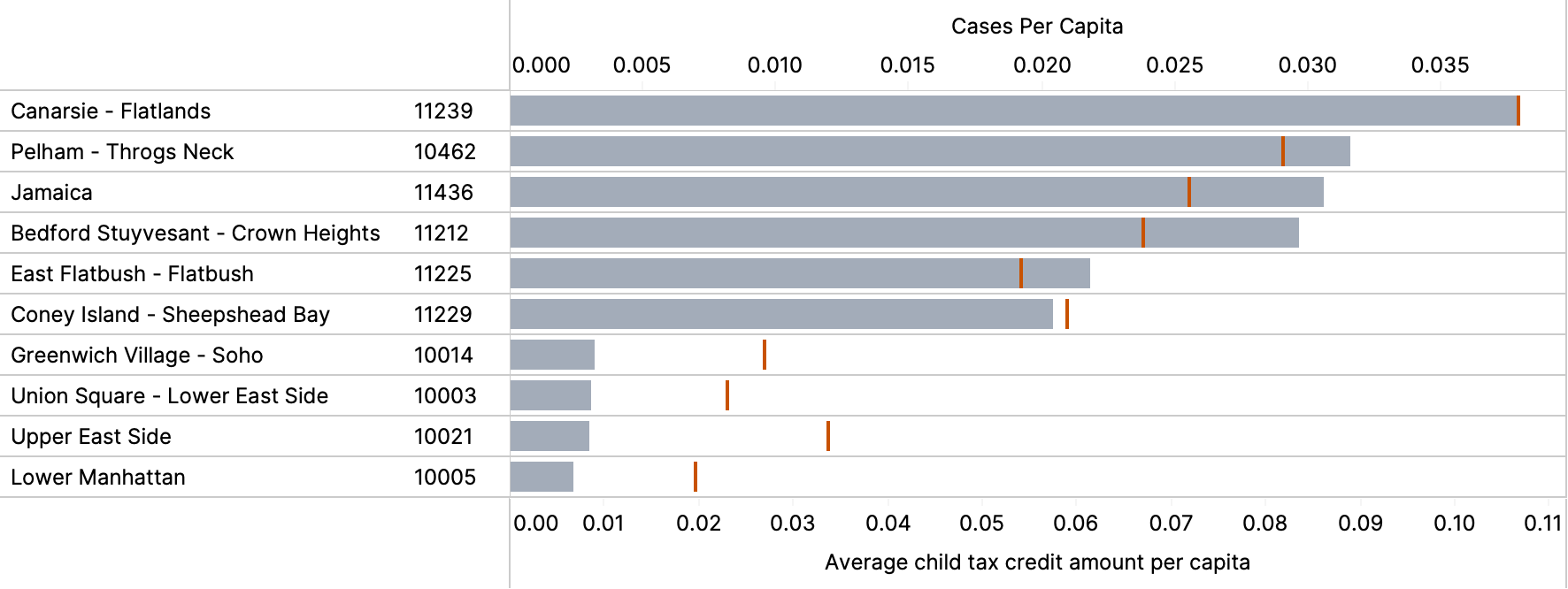
Bars indicate the average child tax credit amount per capita, while the red lines indicate cases per capita
Another strong indicator for COVID-19 cases per capita is the proportion of returns claiming Capital gains. Capital gains is a reflection of income earned from the sale of property or an investment — which is a form of wealth that typically benefits the highest rungs of society. Zip codes with the largest proportion of tax returns claiming capital gains are: 10282 (Tribeca) and 10021 (Lenox Hill) — where 60% and 56% of tax returns include capital gains. On the other end of the spectrum, 10452 (High Bridge) and 10457 (West Bronx) have 1% of returns with capital gains claims. Residents of neighborhoods in the bottom quartile of tax returns claiming capital gains, are roughly 4 times more likely to die from COVID-19 than neighborhoods in the top quartile.
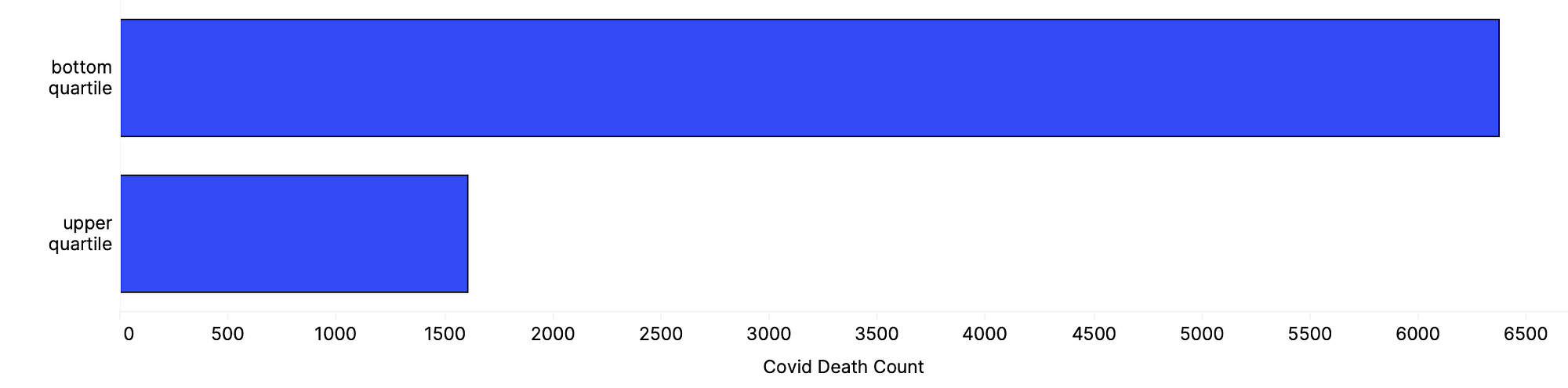
Total deaths related to COVID-19 for zip codes in the upper and bottom quartile in terms of proportion of tax returns claiming capital gains
One of the strongest negatively correlated metrics is the percentage of returns with self-employed health insurance deductions. To be eligible for this deduction, an individual must be a business owner who pays for their own insurance. Zip Codes with high proportions of self employed individuals with health insurance deductions are: 10024 (Upper West Side), 10021 (Upper East Side) and 10022 (Gramercy Park) — each with between 7–9% of returns claiming this deduction. At the other end of the spectrum: 10455 (Hunts Point), 10453 (Morris Heights), and 10472 (Pelham) — each with 0 returns claiming this deduction.
Predicting Cases With so many strong linear relationships between per capita COVID-19 cases and IRS income metrics in New York, we decided to build a regression model to see if we can predict cases[3] within a zip code using only tax data.[4]
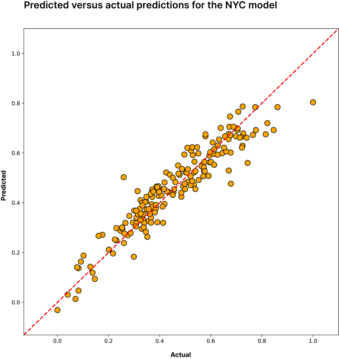
Predicted vs actual cumulative cases per capita in NYC. R2 = 0.88 RMSE = 9%
Selecting appropriate features to power the model without overfitting or biasing the predictions is a tricky problem. We established 2 criteria to guide our selection: (1) p values had to be below 0.001 and (2) the 95% confidence interval (established by doing “non-parametric” bootstrap resampling) of the estimated R value had to be above 0.5. These two conditions left us with 48 unique features to train the model. To mitigate overfitting and multicollinearity, we chose to model the data using a custom[5] kernel ridge regression algorithm. This algorithm combines two properties that alleviate our concerns — regularization and the kernel trick. At a high level, the kernel trick allows us to discover patterns in the data in a higher dimensional space while keeping the input dimensionality low. Regularization penalizes features to minimize their impact, thus preventing overfitting. Using this approach we achieved an R2 of 0.88 and an NRMSE[6] of 9% using 10-fold cross validation.
Extensibility to other geographies With these strong results in hand, we wanted to see how extensible a model trained on NYC tax data is to other geographies. Tax and COVID-19 data is highly skewed — NYC has far higher income and case counts than anywhere else in the country; to mitigate this we looked at normalized tax and COVID data relative to the region. We gathered data for four additional cities: Chicago, Baltimore, San Francisco, and Richmond and ran the model attempting to predict normalized cumulative cases for each city. Model accuracy is shown in the table below:
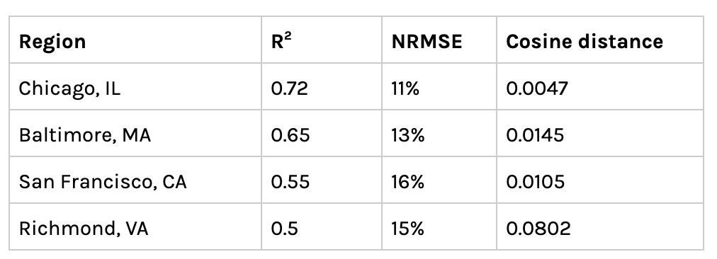
Model performance in other geographies. Cosine Distance measures similarity to NYC, smaller => more similar
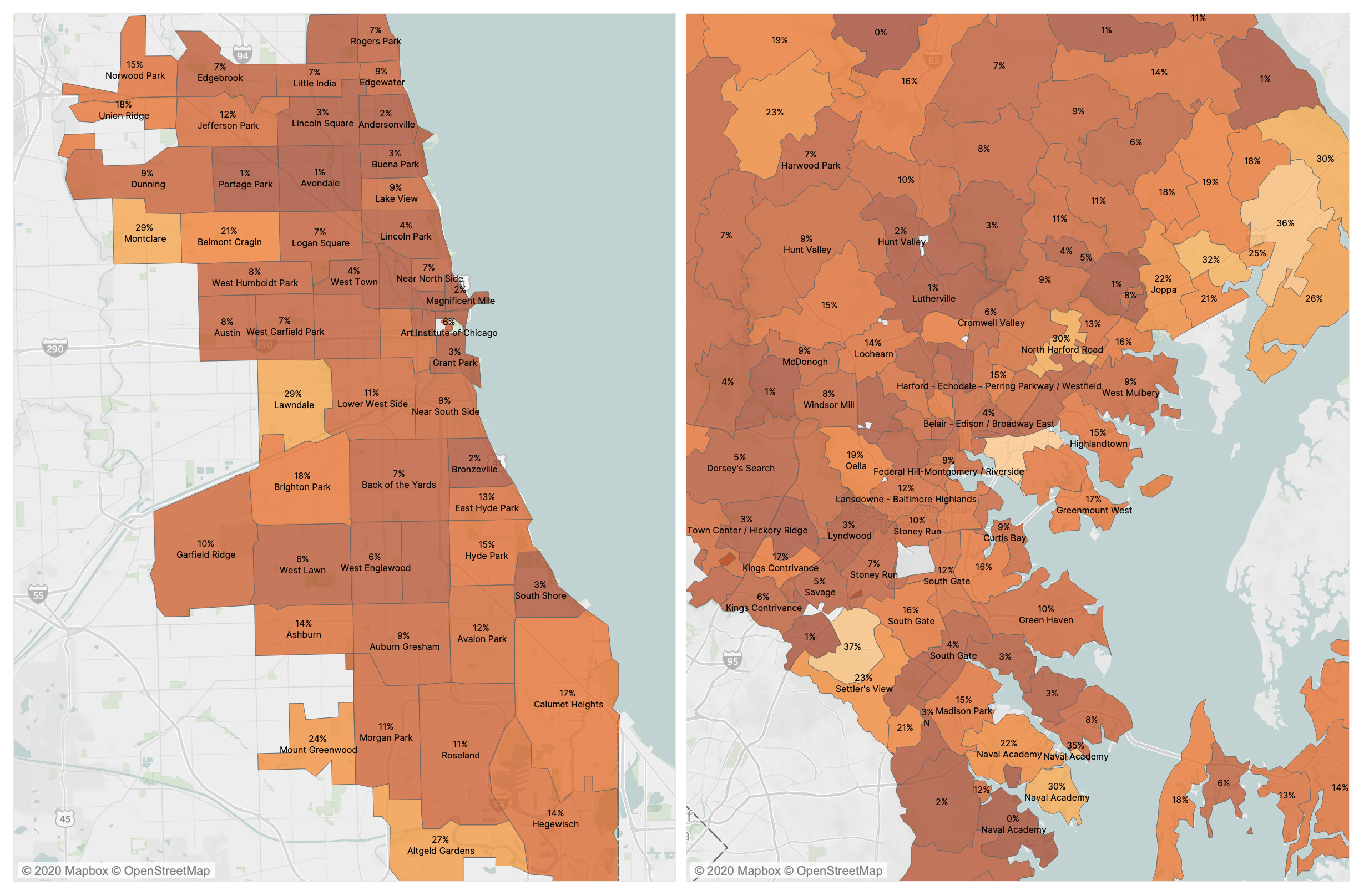
Left: choropleth of model performance by zipcode in Chicago. Right: choropleth of model performance by zipcode in Baltimore. Darker => model is more accurate
The model translates very well to Chicago achieving an R2 of 0.72 and an NRMSE of 11% — meaning the predicted cumulative cases are usually +– 11% from the actual number. In contrast, the model performed poorly in Richmond, getting an R2 of 0.5 and NRMSE of 15%. One possible hypothesis for explaining the performance across geographies, is looking at model accuracy in relation to the similarity between NYC and other cities. As in our previous post exploring COVID across similar geographies, we constructed vectors for each city from metrics with a statistically significant relationship to COVID cases such as commuter transportation mode and residential housing types, and looked at the distance between places in this high dimensional space. Although we only have four data points, it is clear that the model performs better in cities that are more similar to NYC in terms of transportation and building types. On average, the model also has a lower error rate in denser, more urban neighborhoods. Looking at the above map of error rates for Chicago and Baltimore, centrally located zip codes like Magnificent Mile, Chicago or Midway East, Baltimore are approximately 1% +– off the actual case numbers. In contrast, primarily residential zip codes on the peripheries like Montclare, Chicago or Essex, Baltimore are well over 20% off.
In addition to training a model on NYC data, we also tested a model trained on four cities together, predicting cases for a withheld fifth. For example, we trained a model using data from Baltimore, Richmond, NYC, San Francisco and predicted cumulative cases in Chicago. Including multiple cities significantly improved the model performance for Chicago, achieving an R2 of 0.84 and an NRMSE of 9%. However, introducing additional cities lowered the model performance in the case of Baltimore and NYC. The below table shows model performances for various configurations of training and test sets.
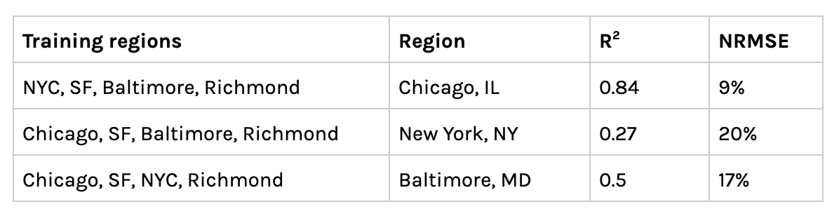
Model performance across various geographical training sets
The fact that IRS data alone can explain over 80% of the variation in COVID-19 cases speaks to the many findings that link the impact of the pandemic to income inequality. Exploring data points that are outside the purview of traditional epidemiology could allow policy makers, medical professionals, and others to better anticipate the effects of future pandemics.
Footnotes:
- Inequality measured by gini index at the state level
- ACS is sent to approximately 295,000 addresses monthly (or 3.5 million per year.)
- Of course, the number of cases in New York is growing by the day, so for this exercise we are predicting the relative/normalized number of cumulative cases in New York for a particular date (30th May 2020)
- As the data is highly right skewed — meaning just a few number of zip codes have very large case counts, while many others have low amounts (relatively) — we transformed the data (taking the square root) for a more normal distribution.
- Extending the built in list of kernels in sci-kit learn to include a Power kernel (also known as the unrectified triangular kernel)
- Normalized root mean squared error